Peacock
Verfijnd, compacter woordmerk; gestapelde stippen van zes naar vijf, met verloop; vereenvoudigd app-icoon
Peacock-logo voor en na
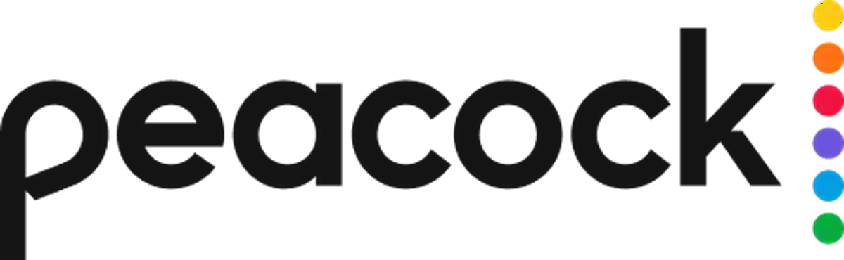

VoorTot mei 2026
Logo: Peacock. Bron: peacocktv.com (gearchiveerd)
DownloadLichtSVG niet beschikbaarPNGDonkerSVG niet beschikbaarPNGVersie voor lichte modus aangepast door Merklog


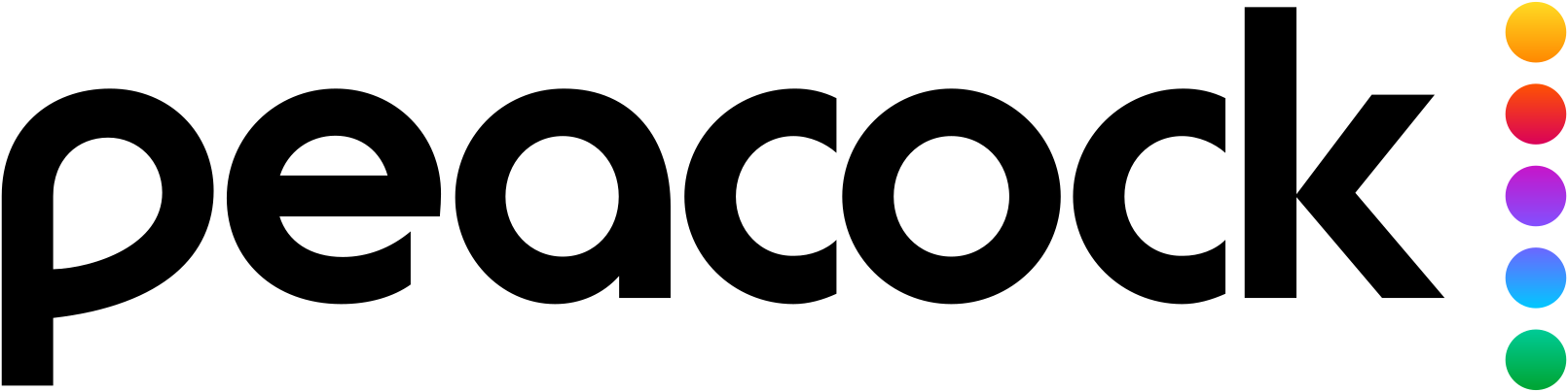
NaSinds 12 mei 2026
Logo Peacock via Wikimedia Commons (maker: NBCUniversal). Bron: commons.wikimedia.org
Feiten op een rij
Peacock lanceerde op 12 mei 2026 een nieuw logo, ontworpen door NBCUniversal (intern).
- Merk
- Peacock
- Gelanceerd
- Studio
- Peacock (intern)
- Wat er veranderde
- Verfijnd, compacter woordmerk; gestapelde stippen van zes naar vijf, met verloop; vereenvoudigd app-icoon.
- Bronnen
- newscaststudio.com, tvnewscheck.com
Zo citeer je deze pagina Merklog, "Nieuw Peacock-logo (2026)", https://rebrandlog.com/rebrand/peacock/, laatst bijgewerkt .
Onderbouwing
Een verfijning voor betere leesbaarheid op mobiel en kleine schermen, geen volledige rebrand.
Pers
Reacties
- Kristopher@theannoyingest on X:( just saw the new peacock logo and its kinda fugly but now I know NBC is probably gonna update their logo as well to be reminiscent of the old futura one but that’s so dumb because they literally just redid their…12 May 2026 · 0 likes
- Sports TV News & Updates@TVSportsUpdates on XCredit to ESPN for using the new Peacock logo. It feels like NBC has still used the old logo half the time on-air since they made the change.20 May 2026 · 363 likes
- Jason Colavito@JasonColavito on XI hate the new @peacock logo. Not only does reducing the circles to five with a weird rainbow gradient mean they no longer correspond to the six NBC peacock feathers, but the letters now look like those of rival…15 May 2026 · 8 likes
- Justin De La Torre-Hurtado@JDTFridaysFan97 on X@comcast @nbcuniversal recently rebranded its @peacock Streaming Service logo #peacock #peacocktv #comcast #nbcuniversal #nbcu12 May 2026 · 0 likes
- Sports TV News & Updates@TVSportsUpdates on XPeacock quietly debuted a new logo this week. The changes include a new typeface, as well as the removal of the orange dot. (The six dots previously represented each colored feather in the NBC logo.) Also, a slight…15 May 2026 · 1,037 likes
Bronnen
- 1. newscaststudio.comhttps://www.newscaststudio.com/2026/05/12/new-peacock-logo-2026/
- 2. tvnewscheck.comhttps://tvnewscheck.com/promotion/article/peacock-shifting-to-updated-logo-with-refined-type-one-fewer-dot/